Designing for Yourself Is Harder Than You Think
I’ve been working in the technology sector for over twenty years, mostly on the strategy, design and front-end side of things. But as I found out, designing something for yourself is far harder than it looks… too much second-guessing, too many directions, and never quite finishing. Fast forward a couple of decades, and one thing I’ve learned is this: designing something for yourself is much harder than you’d think. For me, it’s a cocktail of indecision and procrastination. I love design, but it would have taken me five times longer to get anything done.
That’s why I turned to one of my oldest friends and one of the best designers I’ve ever worked with Iain Hector.
We started by going deep into research. What already existed out there? Who would want this product? What circles did they move in? And, crucially, what made it different? We wanted to define exactly what we stood for and what we represented before even thinking about a name.
Naming turned out to be the hardest part. It had to feel right, simple, memorable, meaningful, while capturing both origin and destination, and still having a domain name available (no small feat). When we landed on LOOP, it just clicked.
The word itself had a natural rhythm and balance, and as Iain later explained, it was a designer’s dream to work with.
“The word ‘LOOP’ provides a convenient set of letters for a logo designer to work with,” Iain said. “It has a natural symmetry with the double-O in the middle, and its meaning evokes geometrical forms, circles, arcs, spirals, repeating shapes, all of which we explored early on.”
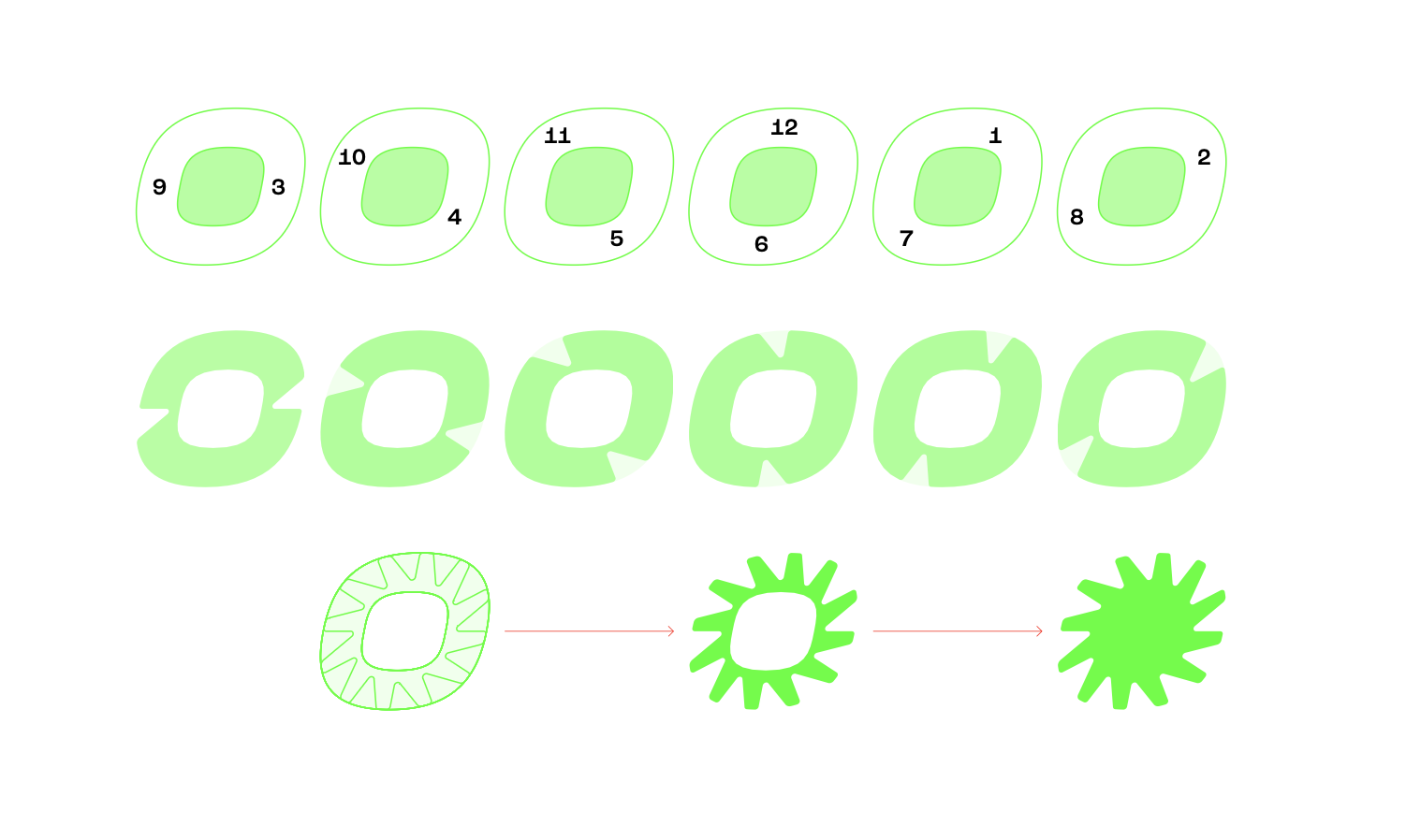
The chosen direction for the logo blended a number of ideas that underpin the brand. The repeated triangular cuts across the letters form arrow-like shapes, nodding to wind direction, compass points, and the hours on a watch face, but also to the idea of something that refers back to itself. That sense of looking back and pointing forward felt perfect for LOOP’s mission: giving sails another life that would otherwise go to waste.
From certain angles, a lightning bolt emerges from the negative space, adding a feeling of charge and movement. The result is a bold, confident word-mark that works equally well in full or as standalone initials, the L or the O alone are strong enough to carry the brand. The letterforms are heavy and low contrast so they can be embroidered, stitched, or printed across a wide range of materials.
Supporting the logo is a secondary mark, nicknamed the LOOP Gyro, a 12-spoked circular shape reminiscent of a sun, cyclone, or cog. Derived from the letter O and repeated at 30º angles, it hints at the rhythm of time, the pulse of motion, and the energy of constant renewal.
Colour was another big challenge. We had no idea what the sails would look like until they arrived, they came in all shapes, colours, and textures, so the branding needed flexibility. Iain took inspiration from the high-visibility palette of nautical flags: crisp blues, reds, yellows, and whites, alongside deeper muted tones and neutral greys for balance. The combinations are bold and unapologetic, reflecting both the unpredictability of the materials and the spirit of adventure that LOOP represents.
That’s how LOOP came to life, a name that loops back on itself, a design that captures movement and purpose, and a brand that stands for giving something worn a new beginning.


